
By Vittorio Zaccaria DynCSS is a small Javascript add-on for your web pages. It parses your CSS and converts all the rules with prefix -dyn-* into dynamic Javascript that is executed on browser’s events like scroll and resize. For example, the following CSS will center vertically .header, dynamically changing margin-top as the window is resized: […]

Using Media Queries in JavaScript
By Krasimir Tsonev If you practice responsive design then you use a lot of media queries. Media Queries are a CSS feature that gives designers the power to add something like if statements. By this I mean that it allows you to apply rules only if the current page meets certain conditions. In this article […]

Grids in CSS3
By Tim Severien In this article, we’ll take a look at some of the new features in CSS3 that make handling grids using HTML and CSS much easier. But first let’s discuss a little history of grids in HTML and CSS to get an understanding of what made them difficult. A Short History of Grids […]

Using CSS Regions in Responsive Designs
By Brian Rinaldi The CSS Regions specification allows you to create multiple containers into which content can flow into and out of. This can be especially useful for creating complex, magazine-like layouts with irregularly shaped content layers. Recently an article came out that has led many people to feel negatively about the CSS Regions spec. […]

5 Most Exciting Features of Foundation 5
By Zing Design We’ve eagerly awaited the release of the latest version of Foundation, Zurb’s hugely popular front-end framework. It has finally arrived and I’m sure a lot of designers and front-end developers are eager to put it to the test. We were lucky enough to have a sneak preview of the framework before it […]

Playing with CSS Regions in Edge Reflow
By Joan Lafferty Kids spend most of their awake hours just playing. This helps them to understand the world and figure out how things work. In fact, the picture above is of my son playing with paint and learning about colors. With Edge Reflow’s latest public release, we are giving you the opportunity to play, learn, […]

Break The Wrist And Walk Away: Responsive Design And Bootstrap 3
By Burke Holland This is me and design. I want to be a designer. I want to build beautiful sites. I don’t just want to code, I want to be an artist. A creative. I work for a UI company. Everything that I live and breathe is UI. The sad truth of the matter is […]
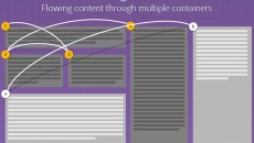
Responsive Content Using CSS Regions
By Alan Greenblatt CSS Regions allow content to flow across multiple areas of the display, called regions. The beauty of CSS Regions is that you can separate the content from the layout. And with that comes the ability to create some responsive content very easily. flow-into and flow-from The flow-into CSS property can be used to prevent […]

Coding for Responsive State Changes with SimpleStateManager
By Jonathan Fielding A month ago I wrote about how to handle responsive states in JavaScript. I looked at how you could roll your own solution and also did a comparison between Enquire.js and SimpleStateManager. SimpleStateManager is a responsive state manager that allows you to run different JavaScript at different browser widths. A month on, […]

Introduction to Topcoat
By Chris Griffith Topcoat is a brand new open source component library built entirely on web standards (CSS and HTML) and is available at topcoat.io. It was designed to assist developers and designers in creating high-performance web and PhoneGap applications. This project was announced shortly before the 2013 Adobe MAX conference and, in fact, the […]
- 1
- 2